


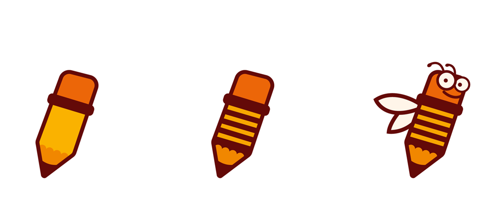
before
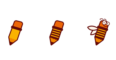
after
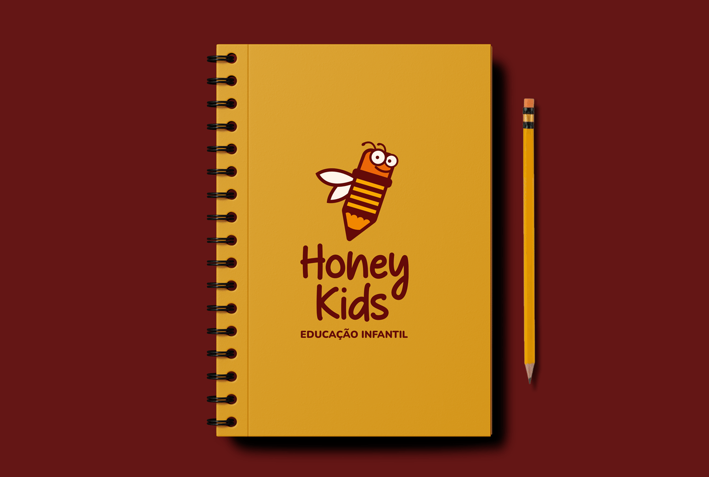
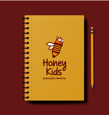
Honey Kids
In addition to keeping the bee illustration as the central element of the brand (a symbol of discipline and cooperation), a pencil reference was added, replacing the stinger and reinforcing the concept of education. The logo was designed using typography that evokes handwriting, including a subtle reference to a drop of honey dripping from the letter “y.” Since the school is aimed at children aged 3 to 5 years old, the redesign was developed with the goal of being playful to appeal to the young students, while also being professional to convey credibility to the parents.


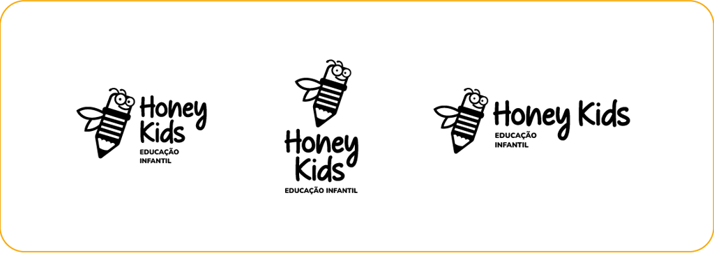


Brand Redesign